Becoming Data Driven: Lessons from a Camaro Dashboard
How does a person interpret a metric the first time they see it?
How does a person interpret a metric the first time they see it?
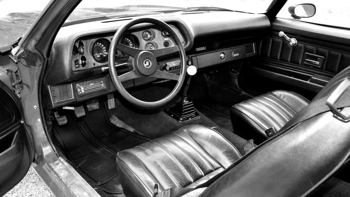
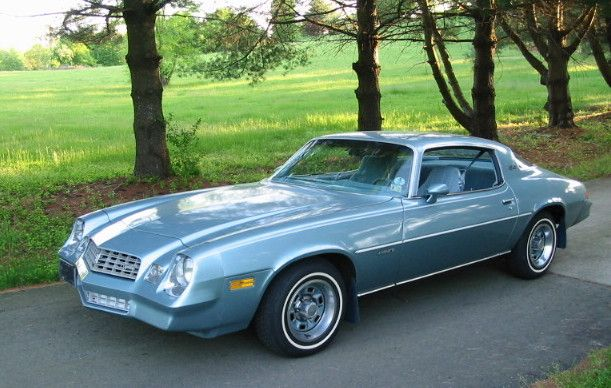
One of the first cars I associate with my Dad was a late 1970's blue Chevrolet Camaro. It had sleek lines, sat low to the ground, and had a hood that seemed to go on for miles. It also had a manual transmission with a bent stick shift with a ball on top. To my five-year old eyes, this sports car was the epitome of cool.
Reading a dashboard as a five-year old.
When riding along in the Camaro with my Dad, I used to watch the dials on the dashboard. The feeling of acceleration in my seat seemed to be attached to the needles on the two biggest gauges.
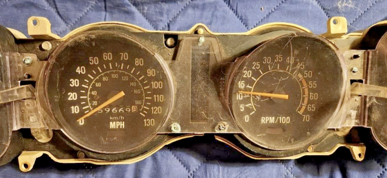
The dial on the left is the speedometer. This delivers the current speed in miles per hour (MPH), a number that corresponded with the posted speed limit signs we passed by the side of the road. Since I could see both of these numbers and relate them to each other, it all made perfect sense.
The second gauge was more of a mystery. This is the tachometer, which measures the current revolutions per minute of the engine. The rise and fall of this needle were more frequent, yet also seemed to align with the shifting of the gears and the perception of speed I felt.
Sometimes both of these needles pointed the same way or the numbers lined up with the road signs, but usually they didn't. It was all kind of confusing.
I remember asking my Dad what this all meant, but his explanation didn't exactly sink in. It was kind of interesting, but also beyond my experience and understanding, and nothing that I had any control over.
Fast forward: Same dashboard as a nineteen-year old.
Sadly, the Camaro was long gone by the time I started driving. The true meaning of the tachometer would remain a mystery until college, when I learned how to drive a stick shift car out of necessity.
With my foot on a clutch for the first time, the dial that once confused me suddenly lit up with obvious context. As I revved the engine and slowly mastered the art of putting the car in gear, this needle's movements provided me with the all-important cue to shift up or down.
Good Dashboards: Always simple, sometimes meaningful.
Dashboards exist to deliver key information at a glance to a specific audience, usually in the context of a job to be done.
When you are part of that audience, you might take it for granted how easy it is to read and understand a dashboard, especially a well-designed one.
Here's the thing:
The information a user sees on a dashboard is all about their perspective, experience, and interests, and may not align what you intended for them to see.
Remember, the meaning always ends in the eye of the user. If you're expecting them to act on what they see in a certain way, make sure they understand what you had in mind.
Looking for a partner to bring a five-year old's curiosity, an analyst's perspective, and an engineer's discipline to your next data analytics project?
Bonus Fun: Enjoy the Full Camaro Experience
With this classic rock playlist, selected 100% from memory, you too can experience a taste of the backseat life.